Scope
Logo and the name of website.
I designed this logo on the hackathon Social Weekend 2018.
Our task was to create a website to help people with schizophrenia get higher education.
Of course, this task was not easy. Our logo should be calm and reflect the meaning of our website.
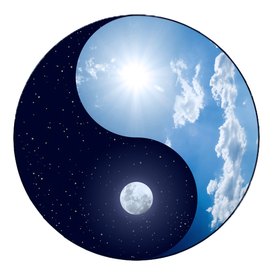
That's why I took Yin-Yang as a basis.
Dark and light, day and night. In a word - HARMONY.
This is definitely what we need.
With my team, we decided that the name of the project would be SCOPE. I don’t remember why, but it definitely has deep meaning.
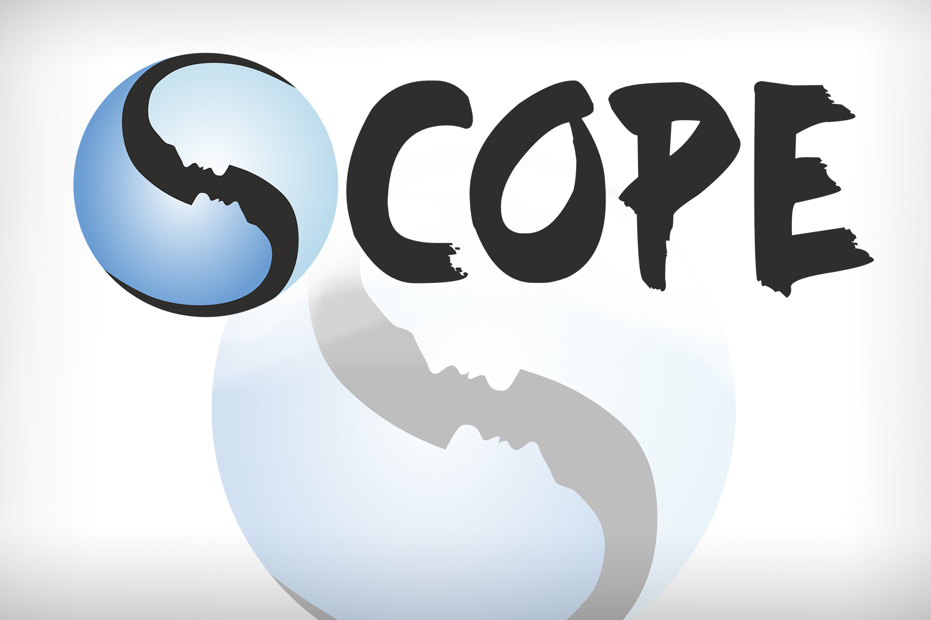
The first letter S was very useful, so I used it in the logo.
I also added the outlines of faces opposite each other.
This is a very elegant element that has a truly deep meaning. I used a light color palette with soothing blue hues.
As a result, we got two color versions.
The version with blue shades that will be used exactly as the main logo.
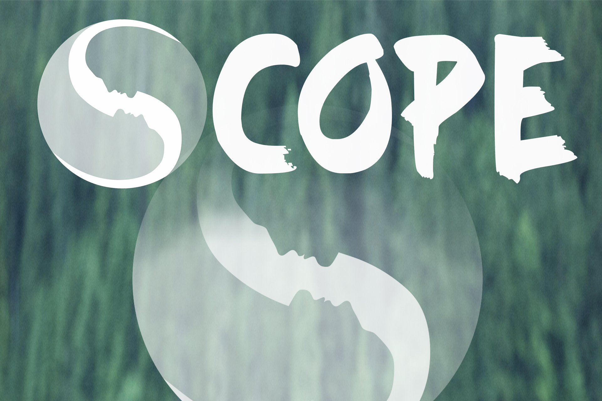
And the white version with translucent parts, which we used as an element of the background for our website.
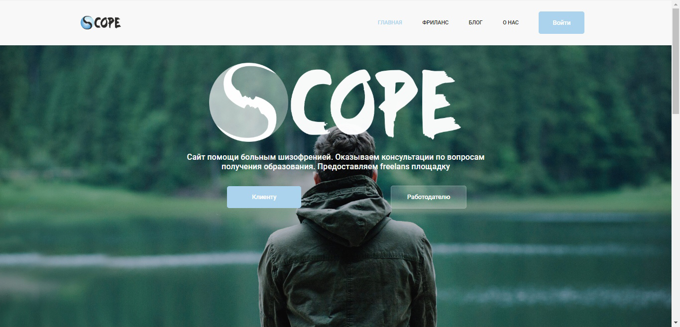
The starting page of our website.